You’ve got your product, your website, and you’re ready to go. But… no one is buying anything from your website! Once you’ve ruled out technical issues, you may be left scratching your head. If you’re stumped about why your site isn’t selling your product or service (whether that’s hotel rooms, clothes, quilts, or something else entirely), read on.
Today we’re covering a few top tips for reducing friction on your e-commerce website. Friction is anything that gets between your potential customer and the ‘complete purchase’ button. Friction points are what we’re trying to get rid of. These are features (or bugs) of your site that cause attention to drop off, back buttons to be clicked, or confusion or distress from your users.
When you remove friction points, your conversion rate – the percentage of your website visitors who turn into buyers – soars. Without further delay, here are 5 tips for reducing friction on your e-commerce website and increasing your conversion rate:
SITE SPEED
This is one of the most shouted about issues when it comes to advice on improving your website’s performance, and it’s for a good reason. Here are two damning statistics:
- Website conversion rates drop an average of 4.42% with every additional second of load time, when your website loads in between 0 and 5 seconds.
- The average mobile web page takes 15.3 seconds to load.
To see how long your own website is taking to load, and get advice on how to improve that load speed, check out Google’s PageSpeed Insights.
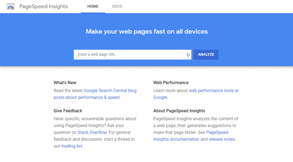
Take the results of your PageSpeed check to your developers and let them help you! A good developer, along with cleaning up your code and checking common issues such as hosting, will often have workarounds like lazy loading for your all-important gallery page that will make it easy to compromise between visuals and functionality.
However, at the end of the day, we think it’s worth dropping a heavy animation or video to increase your conversion rate. Your goal is to make your website more profitable, whether you’re selling products directly, or hoping for emails or calls.
NAVIGATION: KEEP IT SIMPLE
When you’re building – or re-building – your website, consider your site navigation carefully. Site navigation is a whole field on its own, so we’re going to stick to just two key features today: simplicity and visibility.
Simple Menus Win
The more complex your e-commerce website, the more menu items you’re going to want, but resist temptation. Your goal is to make navigating your website simple. This means having as few menu items as possible while making it easy for people to get to your important pages in as few clicks as possible.
The optimal number of main menu headings for conversion is usually thought to be between five and seven (seven is about the number of items we can fit in our short term memory). There are outliers, but based on average desktop screen sizes and how humans deal with choices, five to seven menu items are a good starting point for reducing friction on your e-commerce website. For complex e-commerce sites, consider dropdowns or mega menus for your product categories – here’s a good example from Swiss Gear:
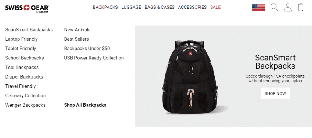
The generous white space and way menu items are sorted (types and features) makes it easy to take in at a glance and easy to make a decision about where to click. Also, you’ll notice that they have just five main menu items, as well as easily recognizable icons for site search, account login and the checkout cart.
Don’t hesitate to put any extra, non-essential links in your footer. These might be your social pages, your privacy policy, your careers page and more. Footers are also where users often expect to see a phone number, email address and maybe even a map.
MENUS: TO HIDE OR NOT TO HIDE?
Another question that often pops up (pop-ups: another thing to keep minimal on your site) around navigation is whether to hide your menu or leave it visible. Fortunately, on this one, the studies are clear and direct: hidden menus hurt. This is true on both mobile and desktop, but more true on desktop.
On desktop, when a menu is visible, users are almost twice as likely to find and use it as they are when menus are fully hidden behind hamburger or other icons.
On mobile, fully visible menus aren’t practical, but a partially visible menu (one example of this: your first three menu items and an icon to click for more items) on mobile still gets used an average of 30% more of the time than fully hidden menus.
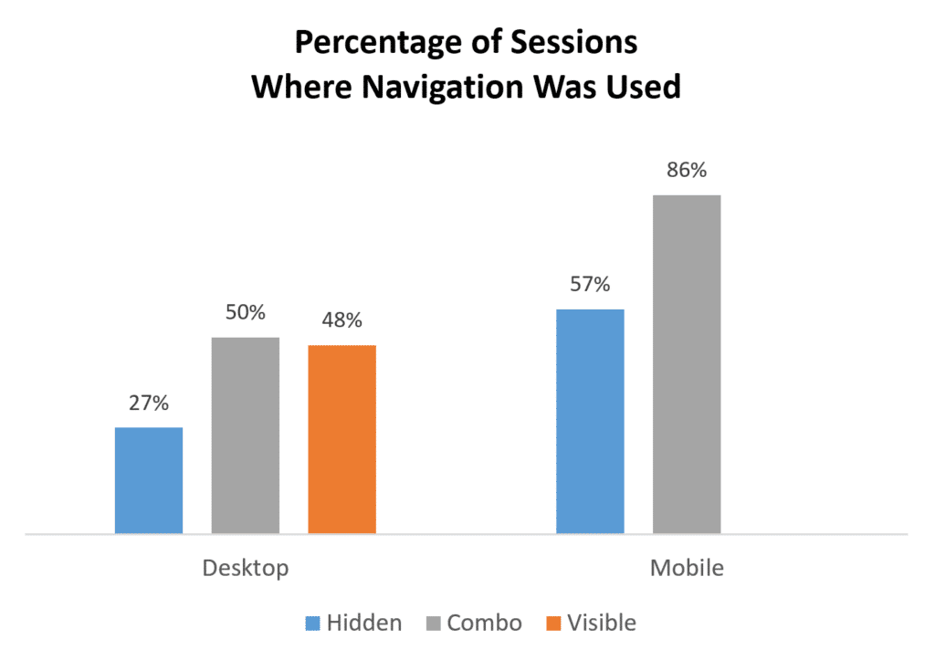
In short: keep your main menu visible and prominent, and make sure your most important pages – products, cart, how to contact you – are linked to clearly.
SIMPLIFY YOUR CHECKOUT PROCESS– AND BE UPFRONT ABOUT IT
When you’re thinking about what you need in your checkout process, you may be thinking in terms of getting as much information out of your customer as you can. After all, the more you know about who buys your products, the better you can tailor your products and your marketing to them, right?
That may be true, but your checkout process isn’t the place to do it. When it comes to getting people from ‘add to bag’ to ‘order complete’, the fewer fields you’re asking people to fill in, the better. Decide what’s essential and cut the rest.
Another common hurdle is asking people to sign up or sign in at the start of the process. Instead, offer a guest checkout option. After the order is complete, you can offer an option to create an account.
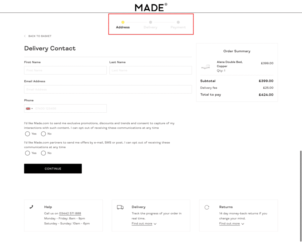
Finally, show the steps left and how far in the process shoppers are. Statista cites long payment processes as the reason 21% of users leave e-commerce checkouts. Below, you can see Made’s progress indicator, and note that there’s only three total steps – the fewer steps, the less friction for your shoppers.
BE TRANSPARENT ABOUT COSTS
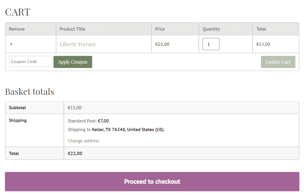
As well as keeping checkout easy, keep it transparent. Unexpected costs are the number one reason users abandon shopping carts on e-commerce websites. You want every card processing fee, tax and shipping cost visible from the very first screen of your checkout process, if not before.
Even if your shipping costs are variable, you can get around this by, say, stating that you offer free shipping on orders above X value, or flat-fee shipping nationally. This indicates that shipping is not free for orders below that value, or flat for orders outside the country, and prepares shoppers for the cost.
Ensure that there’s an ‘order summary’ panel on the first page of your checkout process – as soon as people go to their cart, ideally – that breaks down any extra fees and shows the total before they continue. While you might be afraid of frightening people off, studies show that the more transparent you are, be more prepared users are to buy.
Hopefully this helps de-mystify the world of e-commerce, and gives you some helpful tips for reducing friction points on your own website.

